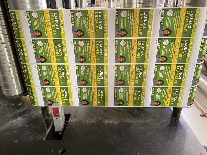
Primeflex understands the power of a perfect print job, and that extends to the colors you choose for your packaging. Consumer buying behavior is heavily influenced by color, and selecting the right shades can make all the difference. Here’s a roadmap to navigate this colorful landscape:
- Know Your Audience: It all starts with your target market. Consider their demographics – age, gender, income, education – and understand their needs and motivations. Think about brands like McDonald’s. Their classic red and yellow evoke energy and youthfulness, perfectly aligned with their young target audience.
- Speak through Color: Let your packaging hint at what’s inside. For instance, the color of a shampoo bottle might suggest its natural ingredients or a specific benefit.
- Stand Out from the Crowd: Don’t blend in on the shelf! Opt for unique colors that differentiate your product from competitors. Take Coca-Cola and Pepsi – their contrasting red and blue hues instantly grab attention. Analyzing competitor color choices can be a strategic move.
- Black & White: Going B&W can actually help you stand out in the crowd, but does it fit your brand and your customers? If the product is basic, cheaper, or organic, black and white might be a great option and much cheaper.
- Color with Purpose: Colors subconsciously communicate messages. Do you want your product to feel comforting or playful? Evoke a sense of security or luxury? Apple’s classic white signifies premium quality.
- Brand Voice in Every Hue: Your packaging colors should reflect your brand identity. Is your brand professional, fun, or rebellious? T-Mobile’s hot pink logo is a bold statement compared to typical blues and reds in the mobile service industry.
- Cultural Considerations: Colors carry cultural meanings. Understanding your target market’s heritage can guide your color selection. For example, red symbolizes good luck in China.
- Design Harmony: Ensure your chosen colors complement your packaging design and chosen fonts. While creativity is encouraged, avoid overwhelming the design. Remember, fonts also convey messages, so your color scheme should resonate with that message.
- Brand Color Consistency: Experimentation is great for new products, but prioritize brand identity. Consumers should recognize your brand regardless of packaging color variations.

Unveiling the Power of Color in Packaging
Have you ever stopped to think about why certain colors are used on your favorite products? It’s not just a random choice! Color psychology plays a powerful role in influencing consumer behavior. Here’s a breakdown of some key colors and the emotions they evoke:
Red: Bold, energetic, and attention-grabbing. Red is perfect for grabbing attention on shelves and triggering impulse buys. It can also hint at passion and intimacy, hence its frequent use on adult product labels.
Orange: Friendly, playful, and full of life. Orange is associated with sunshine and vitality, making it a great choice for beverages, sporting goods, and products promoting an active lifestyle.
Green: Natural, harmonious, and eco-friendly. Green instantly connects with our love of nature and is ideal for promoting organic or health-conscious products.
Black: Sophisticated, luxurious, and high-quality. Black conveys a sense of value and exclusivity, making it perfect for premium brands. However, use it sparingly to avoid overwhelming the design.
White: Clean, pure, and simple. White signifies cleanliness and sterility, ideal for medical or hygiene products. It also promotes a sense of clarity and simplicity, making it a good choice for minimalist designs.

The Power of Color Combinations for Labels
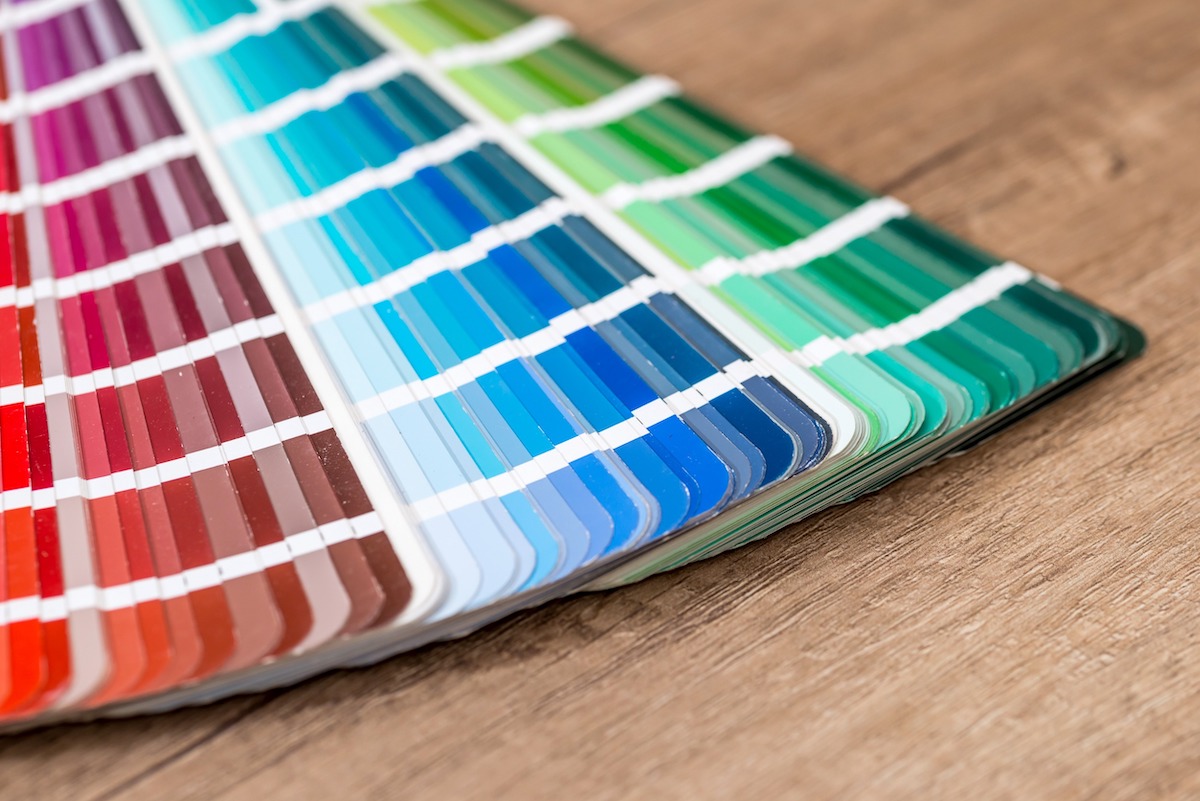
Understanding color psychology goes beyond using individual colors. Combining them strategically creates a stronger message. Complementary colors (opposite on the color wheel) create a vibrant and contrasting effect, while analogous colors (next to each other) offer a more harmonious feel.
By harnessing the power of color, you can create labels that speak directly to your target audience, influencing their decisions and boosting your brand’s impact.
Primeflex is here to help you unlock the power of color in your packaging. We offer a wide range of printing options to bring your vision to life. Contact us today and let’s create packaging that speaks volumes!
Are color labels 25% more effective than black & white? Check out this research from ScienceDirect.
